The Port Authority of New York and New Jersey Traffic Dashboard
This project presents a Power BI dashboard built on public Port Authority traffic data.
Download .pbix file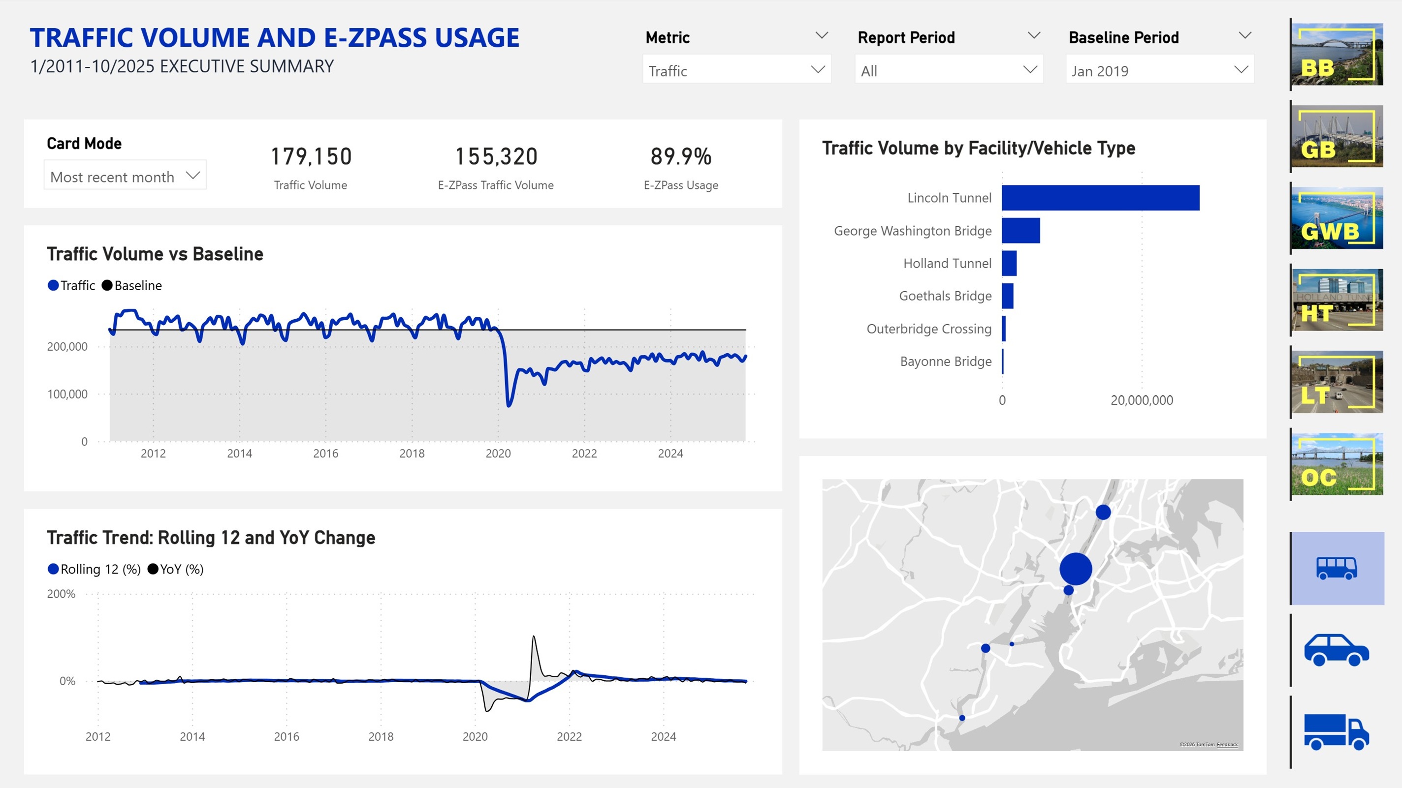

📌 Overview
This Power BI dashboard analyzes monthly traffic volume and E-ZPass usage across six major Port Authority crossings between New York and New Jersey. It consolidates public monthly reports into a single analytical model and makes it easier to explore long-term trends, facility-level differences, and changes in transponder adoption over time.
👤 My Role
I completed this project independently end to end, including source preparation, Power Query transformations, data modeling, DAX logic, visual design, tooltip design, and overall dashboard UX.
🛠️ Tool Stack
Power BI, Power Query, DAX, Excel, PDF-to-Excel source conversion, custom dimension tables, parameter tables, various visuals, and advanced report page tooltips.
🎯 Business Problem
The Port Authority of New York and New Jersey regularly publishes monthly vehicular traffic and E-ZPass usage statistics for its bridges and tunnels. The data is public and useful, but it is distributed as flat monthly PDF tables, which makes cross-period analysis slow and inconvenient.
This dashboard solves that problem by bringing reports from multiple periods into one model and answering a core question: how do traffic volume and E-ZPass usage change over time, and how do those patterns vary by facility and vehicle category?
From a decision-making perspective, this type of analysis can support more focused operational planning and more targeted E-ZPass promotion efforts.
🗂️ Data Source
The report is built entirely on public data published by PANYNJ. Monthly traffic and E-ZPass usage summaries are available from 2011 onward on the official source page: Traffic and Volume Information for Bridges and Tunnels.
🔄 Data Preparation
The source files were already relatively clean, so the main effort was not data cleansing but data structuring for analysis.
Long-format fact tables
In Power Query, I reshaped the original wide monthly tables into two long-format fact tables:
- one for traffic volume
- one for E-ZPass usage percentage
This structure is much better suited for Power BI because it supports reusable measures, cleaner time intelligence, more consistent filtering, and easier metric switching across visuals.
Supporting dimensions
I also created supporting dimension tables for facilities and vehicle types. The facilities table includes coordinates and custom icons to improve map-based analysis and filtering. The vehicle type table includes custom images used for slicers as well, making filtering more intuitive and visually clear.
🧩 Data Model
A key requirement was to let users view both traffic volume and E-ZPass usage on the same page and switch between them through a slicer.
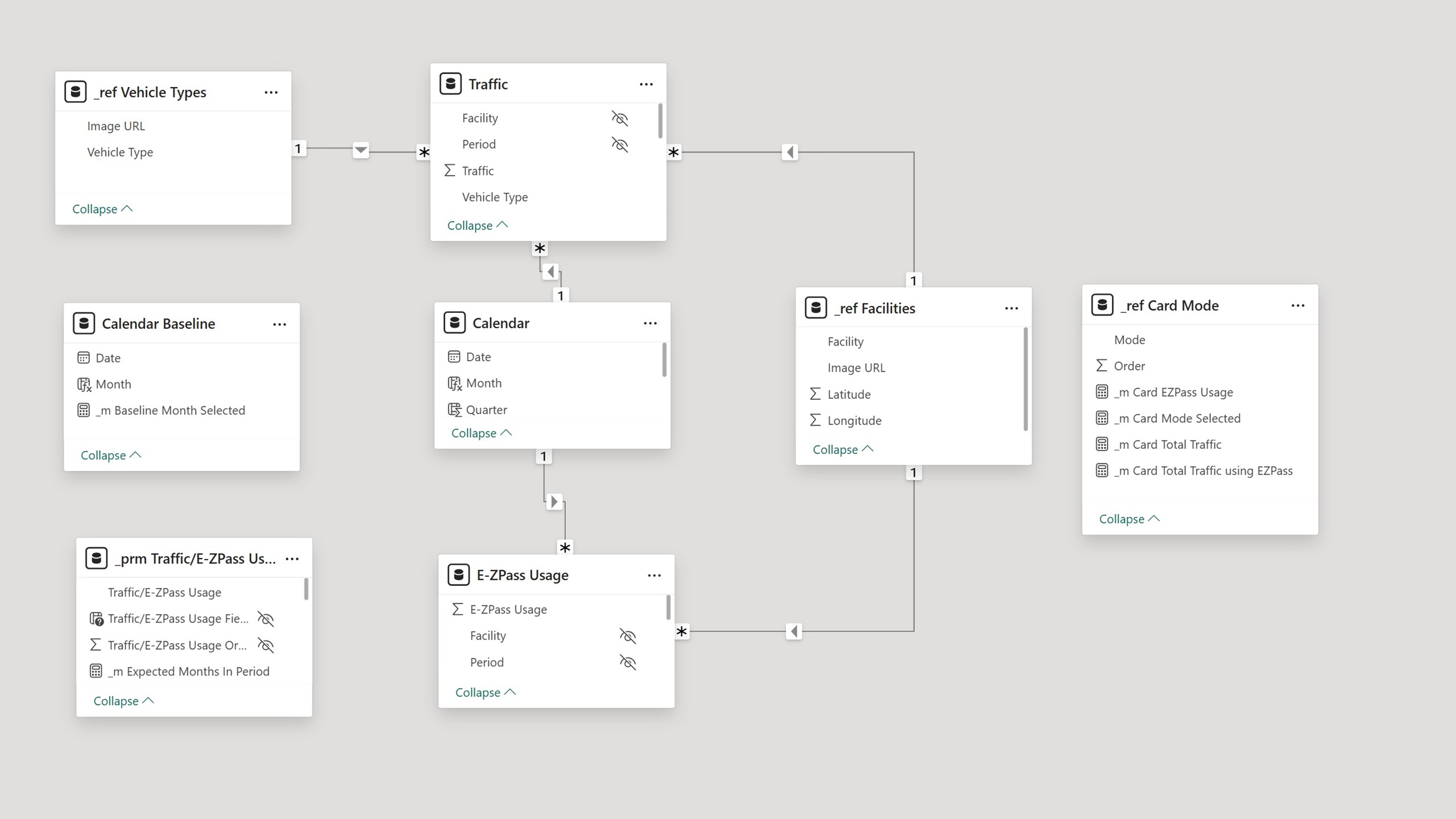
To support that, I designed a unified model where both fact tables connect to:
- a shared calendar table
- a shared facilities dimension
The vehicle type dimension is connected only to the traffic volume table because the E-ZPass usage data is not broken down by vehicle category in the source files.
I also added helper parameter tables to control metric switching and visual behavior. This keeps the report experience consistent while respecting the different granularity of the underlying datasets.
✨ Dashboard Features
Metric switching across the page
The main interaction is the Metric slicer, which lets users switch the entire page between traffic volume and E-ZPass usage. Instead of splitting the report into separate pages, the visuals respond dynamically to the selected metric.
Dynamic baseline for time comparison
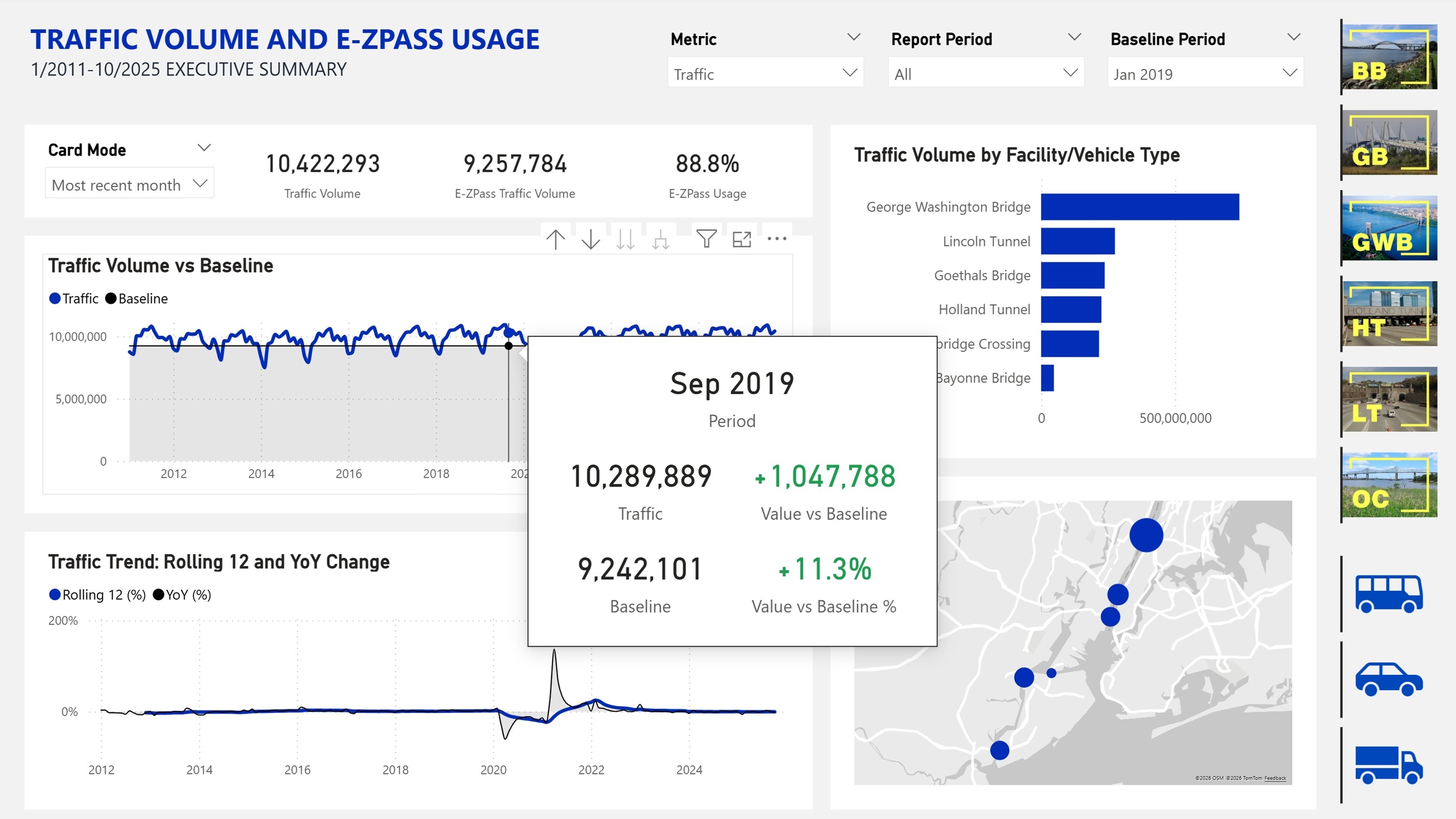
In addition to selecting a time period, users can choose a baseline for comparison. A horizontal reference line on the main time series chart shows that benchmark directly on the visual.
The baseline is dynamic. It recalculates automatically based on the selected level of aggregation, whether the chart is viewed by month, quarter, or year.
Image-based slicers
The dashboard uses image-based slicers for both facility and vehicle type selection. These controls make filtering faster and more intuitive than standard text-only slicers.
Users can also combine filters, for example, to analyze a specific vehicle type at a specific facility.
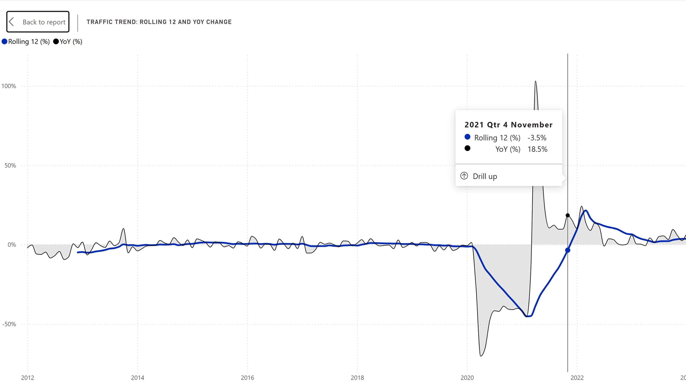
Rolling 12-Month and Year-over-Year views
A secondary line chart shows Rolling 12-Month and Year-over-Year values for the same selected periods.
These measures add useful analytical context:
- Rolling 12-Month smooths short-term volatility and highlights broader trend direction
- Year-over-Year helps identify structural change by comparing the current period with the same period a year earlier
Multiple visual perspectives
Beyond the trend charts, the dashboard includes:
- a horizontal bar chart for quick ranking and comparison
- a map for geographic context and network-level analysis
Advanced tooltips
I designed custom report page tooltips to provide more context than standard Power BI tooltips.
Examples:
- hovering over the main time series shows the selected value plus its deviation from the chosen baseline in both absolute and percentage terms
- hovering over a facility on the map shows a pie chart with the vehicle-type distribution for that location
These tooltips add depth without cluttering the main report canvas.
🔍 Key Insights
- Traffic volume shows strong seasonality, while E-ZPass usage is much more stable over time.
- COVID had a major impact on traffic volume, but a much smaller impact on E-ZPass adoption.
- E-ZPass usage keeps growing overall, but the growth rate has slowed in recent years as adoption approaches a high level.
- Traffic recovered after COVID across most vehicle categories, but bus traffic did not fully return to pre-COVID levels.
- A large share of bus traffic between New York and New Jersey is concentrated at the Lincoln Tunnel, showing clear facility specialization.
- Rolling 12-Month and Year-over-Year views help evaluate structural changes and the effect of E-ZPass promotion efforts more precisely than raw values alone.
🚧 Limitations and Future Improvements
There are several clear paths for extending the project:
- automate ingestion directly from the source PDFs published by PANYNJ
- add forecasting to support planning around traffic shifts and future E-ZPass campaigns
- enrich the model with additional non-sensitive contextual variables to support deeper segmentation and behavioral analysis
These improvements would move the dashboard beyond descriptive reporting toward more advanced decision support.